I have mentioned here in the past that I am working on a manifesto. It’s coming together, and I’m having a blast with it.
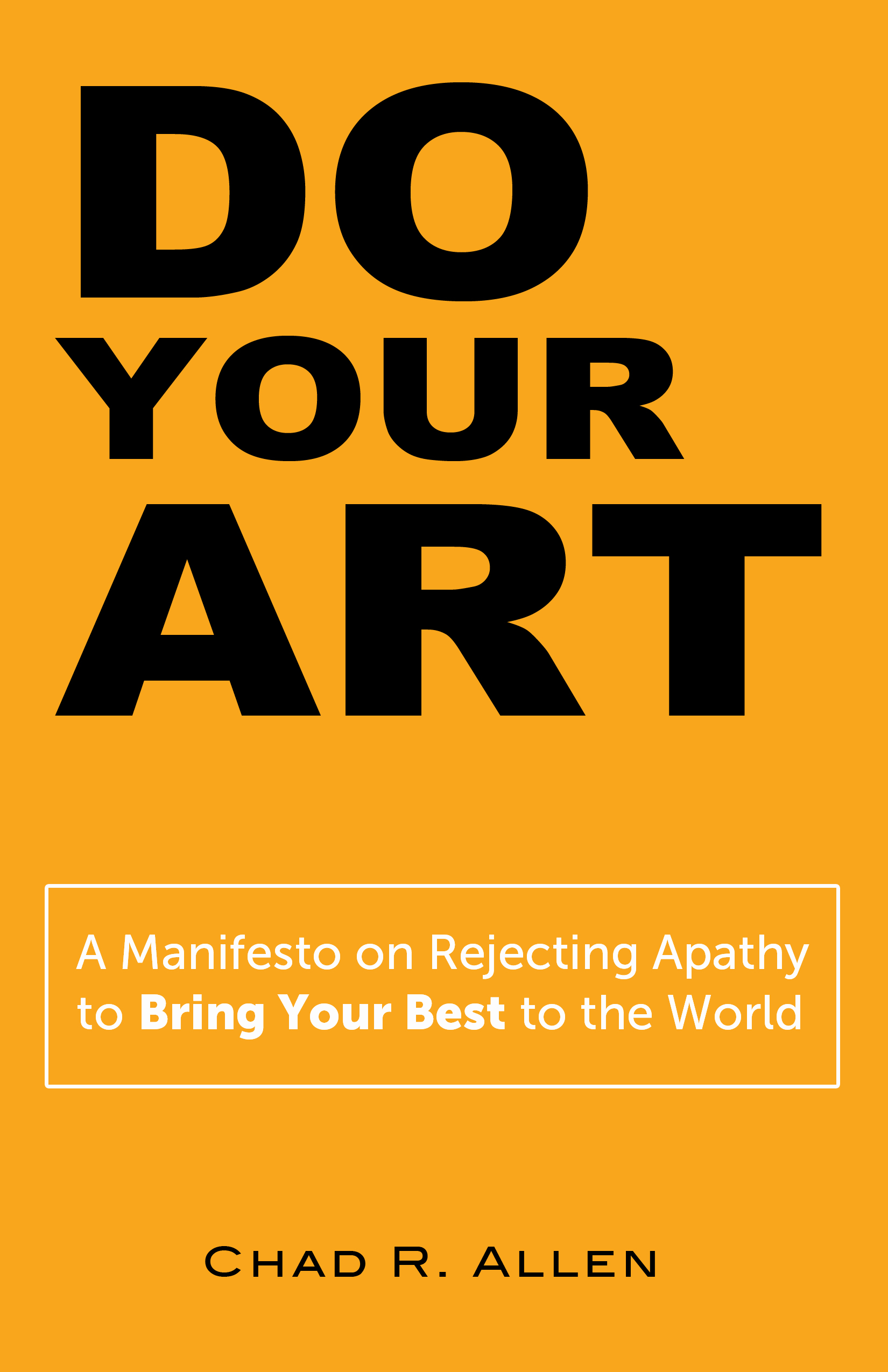
I’d like to share two possible covers with you and hear which one you like better as well as any other comments you might have. Thank you!


29 Responses
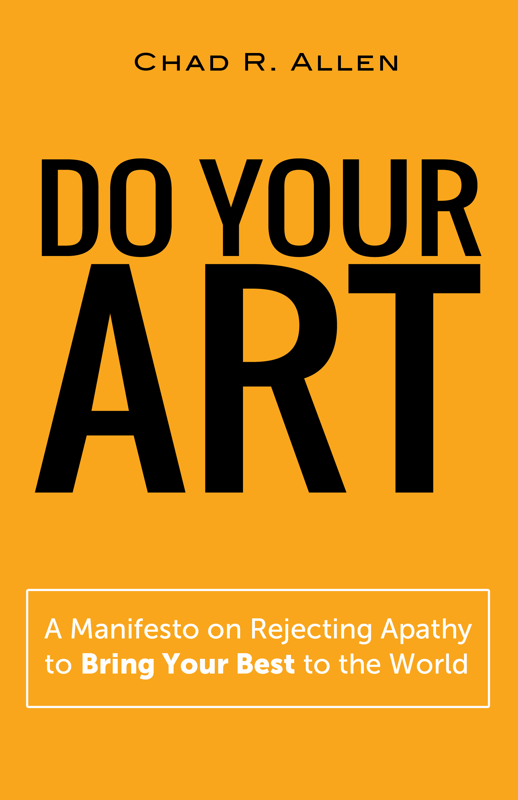
Cover 2…yeppity, yep.
Excited to read, Chad.
#1
I like that the focus is on the action of DO your ART as opposed to the emphasis on the noun ART. I prefer your name at the bottom: reading from top to bottom the emphasis is on the title not your name. Cover #2 feels like a picture hanging slightly crooked on the wall. Even though the letters of “ART” are centered on the cover, because the “A”is centered based upon its left base leg and not the apex, it feels and the optical allusion is that the word is slightly off center. It bothers me enough that I don’t like looking at it. It distracts me from learning more about the book itself.
Hey, Chad, this is exciting.
I would think the decision would have to rest on the emphases inside the covers. Whatever words are larger among the three would, I think, want to be emphatic within.
If all three are equally important (and I can imagine how “your” could deserve equal time) consider making them all of equal size.
If the text of the sub were in black it would be more visible.
I prefer seeing your name on top.
And though it might or might not work visually with black text, red is always a great color for a manifesto.
Can’t wait!
1.
I give my vote for #1 – As the others have noted the emphasis on DO and ART seem to get the point across. Cover 2 seems a bit rigid.
Cover 1! The “Do Art” really pops in that one.
Left (or 1) grabs my attention. Right one looks more… artsy or somethin’. (Not sure what word to use.) I *like* 2 in a decorative, eye-pleasing way, but again, it doesn’t stand out like 1. 🙂
Jessica
Thank you, everybody, for all the insightful feedback. As I mentioned to Bill above, there’s no clear winner here, so hopefully that means I have two good options! Can’t wait to roll this out there!
Cover 2 but would love the word “ART” to have a beefier font.
Cover 1 for sure. Do and Art stick out, obviously. If that is the message of the manifesto, you nailed it.
BTW, when you’re ready to promote it, I can feature it on two of my blogs.
Thanks, C.C.! That would be terrific!
I prefer #1. In addition to the reasons given by others, it’s more visually appealing to me with your name on the bottom as opposed to the top. I agree with Brian that a more concise subtitle would work better.
#2
I’m looking forward to reading it. Do you have an anticipated release date?
I’m afraid I don’t, Denise, much as I’d like to give you one. I’m self-publishing this, so it’s all new to me. I’m learning a TON, which I look forward to sharing with others as I can and as it would be useful to others, but I don’t dare place a public timeline on this little fledgling. She’ll fly when she’s ready. But (now in a whisper) I hope to have it out there later this month. (You didn’t hear me say that!)
Yeah, one more thought–you could shorten the subtitle to: Bring Your Best to the World and give it more focus. Not that you asked about that 🙂
Thanks, Brian. It would be more succinct, you’re right, but I also think something gets lost without “manifesto” in there. It’s a particular genre of thing, you know? But I’ll keep mulling it over…
I visually like the layout of #2 better, but I like the emphasis on Do in #1. I would work with #2 to add the Do emphasis for action, as others mentioned. There are probably millions of books emphasis the Art part, but Do and Art together points to the uniqueness of concept more.
Also, I hugely agree with Bill on styling the subtitle more. I love the subtitle, but it gets lost. I would put that box on a background of another color, and perhaps on a raised graphic, to add texture to the cover overall and bring more focus to the unique subtitle.
Looking forward to it!
I like the design and look of Cover #2 much better.
Hard decision 🙂 I like the centeredness of #2. Can’t wait to read it!
Can’t wait to show it to you!
My vote goes for #2 over #1, but I was initially drawn to #1. Go figure. I like the yellow — it’s eye-catching. I also like that they’ll play well on Amazon, except for the subtitle. Perhaps a touch more artistic typography or styling (a gradient on the yellow?) could better correspond to the message of the book. I’m sure it will be great, and look forward to reading it.
Thanks, Bill! This exercise is underscoring the fact that I think I have two good options here! Btw, we tried a gradient, and it didn’t come through as well as we’d hoped. I guess I like the simplicity of the current background color.
Cover 1. “Do” and “Art” both pop. Nicer proportions. You coudl try the “Your” in a skinnier or unbolded font (like it is in cover 2) to add a little motion/variety for the eyes. Also, you could try that cover with your name at the top and everything else moved down. And maybe close up the space between the title and the sub and lengthen the space between your name and the rest of it instead of having almost equal space between all three elements.
Thanks, Erin. It would be fun to play with some of the spacing.
My vote is cover 2.
And I hereby register your vote! 🙂
I like cover 1. I think the emphasis on “do” is good. Plus it is less rigid than cover 2, so it jars me a bit, which will be more memorable. I think.
I agree with Paul. “Do” prompts action. I also like the bold cover (color). It pops!